Boxplot (Box and Whiskers Diagram)
A boxplot is a data display that allows you to see many attributes of a distribution at a glance. It is constructed by using raw data values to create the 5-number summary, consisting of the minimum value, the first quartile (Q1), the median, the third quartile (Q3), and the maximum value.
The data below represent the sales of Girl Scout cookies by members of a troop. We determine the 5-number summary using procedures introduced previously. The five blue values are the values to the left of the median, from which the value of Q1 is determined. The five red values to the right of the median are used for calculating the value of Q3.
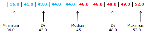
The 5-number summary is: 36, 43, 45, 48, and 52. We create the boxplot by using the 5-number summary, as shown here.
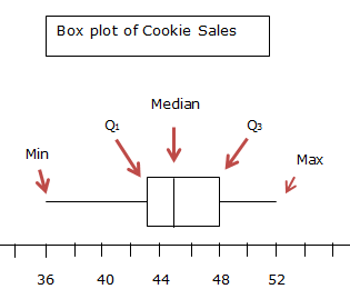
The two whiskers extend from the minimum to Q1 and from Q3 to the maximum. The box extends from Q1 to Q3, and the median is appropriately placed in the box. Note that the median is not necessarily in the middle of the box. The median is at its proper value, here 45.
At a glance, a boxplot displays the range of values, and it shows the middle of the distribution. But its real power is apparent when two boxplots are placed together. The following side-by-side boxplot shows the monthly sales of doughnuts at a small shop, in two different years: 2010 and 2011.
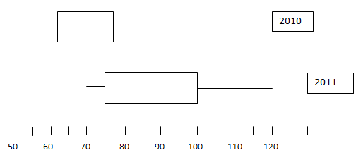
A comparison is quite easy. We see that the worst month in 2010 was the sale of 50 dozen doughnuts, whereas the worst sales month in 2011 was 70 dozen doughnuts. The median monthly sales of doughnuts increased from 75 dozen doughnuts in 2010 to about 88 dozen doughnuts in 2011. Overall, we see that 2011 was a much better year in terms of doughnut sales than was 2010.
The data below represent the sales of Girl Scout cookies by members of a troop. We determine the 5-number summary using procedures introduced previously. The five blue values are the values to the left of the median, from which the value of Q1 is determined. The five red values to the right of the median are used for calculating the value of Q3.
The 5-number summary is: 36, 43, 45, 48, and 52. We create the boxplot by using the 5-number summary, as shown here.
The two whiskers extend from the minimum to Q1 and from Q3 to the maximum. The box extends from Q1 to Q3, and the median is appropriately placed in the box. Note that the median is not necessarily in the middle of the box. The median is at its proper value, here 45.
At a glance, a boxplot displays the range of values, and it shows the middle of the distribution. But its real power is apparent when two boxplots are placed together. The following side-by-side boxplot shows the monthly sales of doughnuts at a small shop, in two different years: 2010 and 2011.
A comparison is quite easy. We see that the worst month in 2010 was the sale of 50 dozen doughnuts, whereas the worst sales month in 2011 was 70 dozen doughnuts. The median monthly sales of doughnuts increased from 75 dozen doughnuts in 2010 to about 88 dozen doughnuts in 2011. Overall, we see that 2011 was a much better year in terms of doughnut sales than was 2010.
|
Related Links: Math Probability and Statistics Measures of Spread: Range, Standard Deviation, and Variance The Normal Distribution - Empirical Rule |
To link to this Boxplot (Box and Whiskers Diagram) page, copy the following code to your site: