Frequency Table - Numerical Data - Categories Are a Range of Values
A more sophisticated type of frequency table that you may encounter will be one in which there are numerical classes, each of which has a range of values. For example, let's assume we are interested in the ages of women who attended a wine-and-cheese book-signing event at our local library. We'd likely be interested in grouping the women into age ranges (classes), then each raw data value is tallied into one of the classes, and the frequency of each class is determined from the tally count.
Here is a frequency table for the ages of women visiting the library during a wine-and-cheese book-signing event.
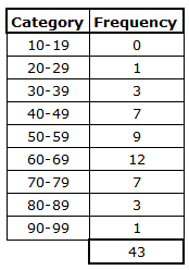
We can see that there were, for example, 7 women in the age class of 40-49 and 1 woman in the age class of 20-29. The frequency table gives us a good summary of the ages, but trying to take in all of the data at once can be overwhelming. To make visualization of the data easier, we often use the data from the frequency table to create a histogram. That is, the histogram gives us a visual picture of the data contained in the frequency table.
A histogram is similar to a bar chart, except that a histogram typically has number ranges (classes) on the x-axis (for example, ages 11-19, ages 20-29, and ages 30-39), and a bar chart typically has categories (for example blue car, red car, yellow car, etc.). Also, the bars on a bar graph do not touch one another, but the bars on a histogram do. On a histogram, the y-axis displays the frequency of each category.
The ages of women who attended the wine-and-cheese book-signing event at our local library produce the following histogram:
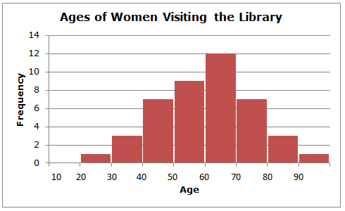
We easily see that the shape of the histogram is roughly symmetrical and that the center is about age 60. Note that the horizontal scale of the histogram shows only the lower values of each class (10, 20, 30, etc.). This serves to keep the histogram uncluttered and easier to interpret.
Notice that if you overlaid a curve on the histogram that it would look roughly like a bell curve. This is a useful feature that can be used for more advanced data analysis.
Here is a frequency table for the ages of women visiting the library during a wine-and-cheese book-signing event.
We can see that there were, for example, 7 women in the age class of 40-49 and 1 woman in the age class of 20-29. The frequency table gives us a good summary of the ages, but trying to take in all of the data at once can be overwhelming. To make visualization of the data easier, we often use the data from the frequency table to create a histogram. That is, the histogram gives us a visual picture of the data contained in the frequency table.
A histogram is similar to a bar chart, except that a histogram typically has number ranges (classes) on the x-axis (for example, ages 11-19, ages 20-29, and ages 30-39), and a bar chart typically has categories (for example blue car, red car, yellow car, etc.). Also, the bars on a bar graph do not touch one another, but the bars on a histogram do. On a histogram, the y-axis displays the frequency of each category.
The ages of women who attended the wine-and-cheese book-signing event at our local library produce the following histogram:
We easily see that the shape of the histogram is roughly symmetrical and that the center is about age 60. Note that the horizontal scale of the histogram shows only the lower values of each class (10, 20, 30, etc.). This serves to keep the histogram uncluttered and easier to interpret.
Notice that if you overlaid a curve on the histogram that it would look roughly like a bell curve. This is a useful feature that can be used for more advanced data analysis.
|
Related Links: Math Probability and Statistics Measures of Center: Mean, Median, and Mode Percentiles and Quartiles |
To link to this Frequency Table - Numerical Data - Categories Are a Range of Values page, copy the following code to your site: