Frequency Table - Categorical Data
A frequency table, also called a frequency distribution, is the basis for creating many graphical displays. It is the initial summary of the raw data in which the data have been grouped for easier interpretation.
First, we need to understand the difference between categorical data (also called qualitative) and numerical data (also called quantitative). Categorical data puts the data into non-numerical categories, such as color, gender, grade on an exam, or type. The color of a car or the breed of a dog would be examples of categorical data. Numerical data, on the other hand, puts the data into numerical categories, such as age, price, height, or number. Some examples of numerical data are the heights of girls in a particular classroom or the number of children in a family.
We can create a frequency table for either categorical or numerical data. For categorical data, each category and its frequency are shown, as in this frequency table, which summarizes the highest degree held by executives in 40 large corporations:
Frequency Table of Highest Degree Held by CEOs of 40 Large Corporations
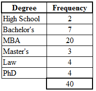
It's easy to see that, for example, 20 of the CEOs have an MBA, 7 have a bachelor's, and 4 have a PhD. Notice that in this example we have categorical data because "degree" is a category. The degree categories are High School, Bachelor's, MBA, Master's, Law, and PhD. Also notice that because the data are categorical in nature, the categories could have been ordered differently. That is, the order in which the categories are presented in a frequency table does not matter.
Sometimes, we might find it desirable to express the frequencies in terms of percentages, and this data can be also be displayed in the frequency table. We first calculate the relative frequency for each category, and then we convert each relative frequency into a percentage. To calculate a relative frequency, divide each category frequency by the total. For "High School," the relative frequency is 2/40, which is equal to 0.050. The decimal 0.050 is converted to a percent by moving the decimal point 2 places to the right, yielding 5%. The basic frequency table can now be expanded to include columns for the relative frequencies and the percentages.
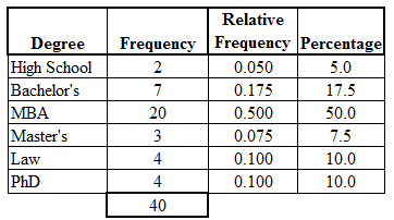
The frequency table, including the addition of the relative frequency and percentages for each category, is a necessary first step for preparing many graphical displays of categorical data, including the pie chart and the bar chart.
First, we need to understand the difference between categorical data (also called qualitative) and numerical data (also called quantitative). Categorical data puts the data into non-numerical categories, such as color, gender, grade on an exam, or type. The color of a car or the breed of a dog would be examples of categorical data. Numerical data, on the other hand, puts the data into numerical categories, such as age, price, height, or number. Some examples of numerical data are the heights of girls in a particular classroom or the number of children in a family.
We can create a frequency table for either categorical or numerical data. For categorical data, each category and its frequency are shown, as in this frequency table, which summarizes the highest degree held by executives in 40 large corporations:
It's easy to see that, for example, 20 of the CEOs have an MBA, 7 have a bachelor's, and 4 have a PhD. Notice that in this example we have categorical data because "degree" is a category. The degree categories are High School, Bachelor's, MBA, Master's, Law, and PhD. Also notice that because the data are categorical in nature, the categories could have been ordered differently. That is, the order in which the categories are presented in a frequency table does not matter.
Sometimes, we might find it desirable to express the frequencies in terms of percentages, and this data can be also be displayed in the frequency table. We first calculate the relative frequency for each category, and then we convert each relative frequency into a percentage. To calculate a relative frequency, divide each category frequency by the total. For "High School," the relative frequency is 2/40, which is equal to 0.050. The decimal 0.050 is converted to a percent by moving the decimal point 2 places to the right, yielding 5%. The basic frequency table can now be expanded to include columns for the relative frequencies and the percentages.
The frequency table, including the addition of the relative frequency and percentages for each category, is a necessary first step for preparing many graphical displays of categorical data, including the pie chart and the bar chart.
|
Related Links: Math Probability and Statistics Frequency Table - Numerical Data - Categories Are a Range of Values Measures of Center: Mean, Median, and Mode |
To link to this Frequency Table - Categorical Data page, copy the following code to your site: