Shapes of Distributions
When we collect and analyze data, that data can be distributed or spread out in different ways. Histograms often give information about the general shape of a distribution.
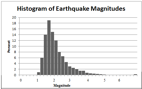
Consider the two histograms below, one showing the magnitude of earthquakes and the other the historical percent returns on stocks. Notice how the shape of each histogram tells us a lot about the data. The earthquake histogram has a large amount of data concentrated in just a few categories at the low magnitude values, and then the graph tapers off rather slowly as the magnitude increases. We say that the shape of this histogram is skewed to the right.
In other words, "skewed to the right" means that most of the data points exist on the left side of the histogram, but we have some "outliers" on the right side of the histogram. An outlier is simply a numerical value that is far from the rest of the data. In our earthquake magnitude example, consider the number of values at 4. We'd consider these to be outliers since they are far from the rest of the data points. We see that it's much more unlikely to see an earthquake of magnitude 4 than of magnitude 2.
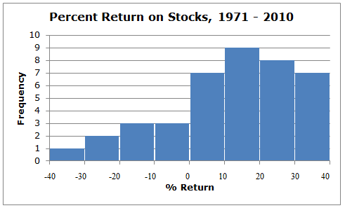
The opposite situation occurs with the histogram showing the percent return on stocks. The percent return on stocks has more concentrated data in the positive returns, and the tapering is to the left. We say that this histogram is skewed to the left. In other words, a left skew means that most of the data points exist on the right side of the histogram, but we have some outliers on the left side of the histogram. For example, we see that a return in the range of 10 to 20 percent is much more likely than one in the range of -40 to -30 percent.
Sometimes we illustrate right and left skewing with smooth curves rather than with histograms, as sketched here:
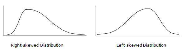
Again, notice that in the right-skewed distribution most of the data points are on the left, with the long tail on the right. Similarly, notice that in a left-skewed distribution, most of the data points are on the right, with a long tail extending to the left.
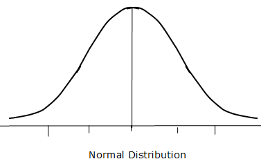
You've now seen the look of right- and left-skewed distributions. We don't always get a skewed distribution, however. In fact, many times, something very interesting occurs. The data takes the shape of a bell. When this occurs, we call this distribution of data the normal distribution, the normal curve, or sometimes the "bell curve" because of its resemblance to the shape of a bell. We use the term "symmetric" to describe the normal curve, because it is not skewed at all; if you folded the curve at its center point (the mean), both halves of the curve would be identical.
For example, if we measured the heights of 10,000 adult males and plotted the results, we'd see a normal distribution. We'd also see a similar normal distribution with SAT scores, diastolic blood pressure readings, and IQ scores. The following distribution shows us the general look and feel of a normal distribution. Notice how it resembles the shape of a bell.
The normal distribution and its properties are extensively used in Statistics, both for describing the shape of a distribution and for calculating probabilities of particular outcomes.
Consider the two histograms below, one showing the magnitude of earthquakes and the other the historical percent returns on stocks. Notice how the shape of each histogram tells us a lot about the data. The earthquake histogram has a large amount of data concentrated in just a few categories at the low magnitude values, and then the graph tapers off rather slowly as the magnitude increases. We say that the shape of this histogram is skewed to the right.
In other words, "skewed to the right" means that most of the data points exist on the left side of the histogram, but we have some "outliers" on the right side of the histogram. An outlier is simply a numerical value that is far from the rest of the data. In our earthquake magnitude example, consider the number of values at 4. We'd consider these to be outliers since they are far from the rest of the data points. We see that it's much more unlikely to see an earthquake of magnitude 4 than of magnitude 2.
The opposite situation occurs with the histogram showing the percent return on stocks. The percent return on stocks has more concentrated data in the positive returns, and the tapering is to the left. We say that this histogram is skewed to the left. In other words, a left skew means that most of the data points exist on the right side of the histogram, but we have some outliers on the left side of the histogram. For example, we see that a return in the range of 10 to 20 percent is much more likely than one in the range of -40 to -30 percent.
Sometimes we illustrate right and left skewing with smooth curves rather than with histograms, as sketched here:
Again, notice that in the right-skewed distribution most of the data points are on the left, with the long tail on the right. Similarly, notice that in a left-skewed distribution, most of the data points are on the right, with a long tail extending to the left.
You've now seen the look of right- and left-skewed distributions. We don't always get a skewed distribution, however. In fact, many times, something very interesting occurs. The data takes the shape of a bell. When this occurs, we call this distribution of data the normal distribution, the normal curve, or sometimes the "bell curve" because of its resemblance to the shape of a bell. We use the term "symmetric" to describe the normal curve, because it is not skewed at all; if you folded the curve at its center point (the mean), both halves of the curve would be identical.
For example, if we measured the heights of 10,000 adult males and plotted the results, we'd see a normal distribution. We'd also see a similar normal distribution with SAT scores, diastolic blood pressure readings, and IQ scores. The following distribution shows us the general look and feel of a normal distribution. Notice how it resembles the shape of a bell.
The normal distribution and its properties are extensively used in Statistics, both for describing the shape of a distribution and for calculating probabilities of particular outcomes.
|
Related Links: Math Probability and Statistics Frequency Table - Categorical Data Frequency Table - Numerical Data - Categories Are a Range of Values |
To link to this Shapes of Distributions page, copy the following code to your site: